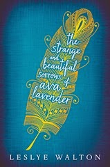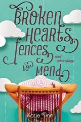
This is a bit different this week, The Broke and The Bookish are asking about what cover trends we love (or hate) and it certainly should be interesting. Now, I am a sucker for a pretty book cover and I do notice that there are certain things which appeal to me when looking at book covers. There are certain book covers a absolutely loathe, but I am not certain there is a particular trend which I hate in book covers. With that I plan to try and focus on cover trends which I love. I don’t think I can think of ten cover trends, but we shall see.
Typography
I think this is the cover trend everyone is love with at the moment. These are books where the title and the lettering, the font, etc. is the main feature of the cover. The only thing really to draw you in, even if there is another feature to the cover art.
Covers that have a pretty photo and an even prettier font to go with
Okay, this one seems very descriptive of a cover trend, but the below images should fully illustrate my meaning. These are some of my favourite covers. These are instant buy books. These are different from typography books because they have genuinely pretty are on the front, but they are not like books where the cover has stunning photographs to draw you in because the fonts are genuinely unique.
Books with interesting photography
I view these as books where the picture is everything, which is kind of true for the above covers, but the fonts push it over the edge. The below covers just have pretty photographs and bog standard fonts to go with.


Books with pretty pretty artwork
These are the books where someone has created stunning artwork which you just want to marvel at when you look at it. The covers that you could genuinely frame on your wall.


The ones which are minimalist but have big impact
The ones which have the title front and centre, but still have some art as well. Everything is done simplistically. This maybe with silhouettes, limited colour scheme. I don’t know, but they are pretty without being cluttered.


Okay, that is only five themes of book covers I like, but I have linked plenty of books, and honestly, the cover is not everything. I don’t always judge a book by it’s cover, the cover just helps me to be interested in the blurb. These are things I like in book covers, there are plenty of other things I like. I thought about listing my pet peeves in cover land, but I could not think of themes that link the pictures together, there are some covers I simply do not like. SOmetimes covers just don’t work. As they say, shit happens.
What about you lot, are there particular cover trends you love. Which ones do you hate? I would love to hear form you either way.


Social Icons